Bridget Durkin
Associate Creative Director
THE SYSTEM
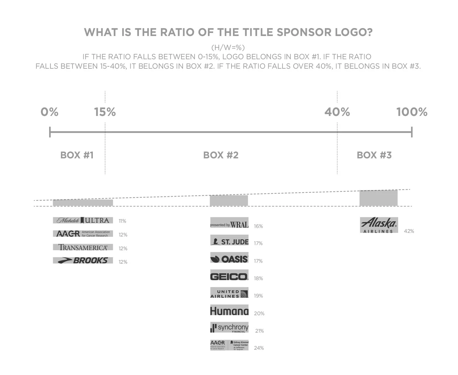
Each box is based on the logo's characters (height and width) of "Rock 'n' Roll"
THE CHART
The Creative department recognized title sponsor logos' varied in sizes, dwarfing the Rock 'n' Roll brand. A solution was developed to accommodate various sizes and structure of logos (stacked, horizontal and even the perfect size...the golden ratio logo). Mathematically the chart was developed to keep title partners' logos in proportion while reclaiming the integrity of the Rock 'n' Roll brand.
THE APPLICATIONS
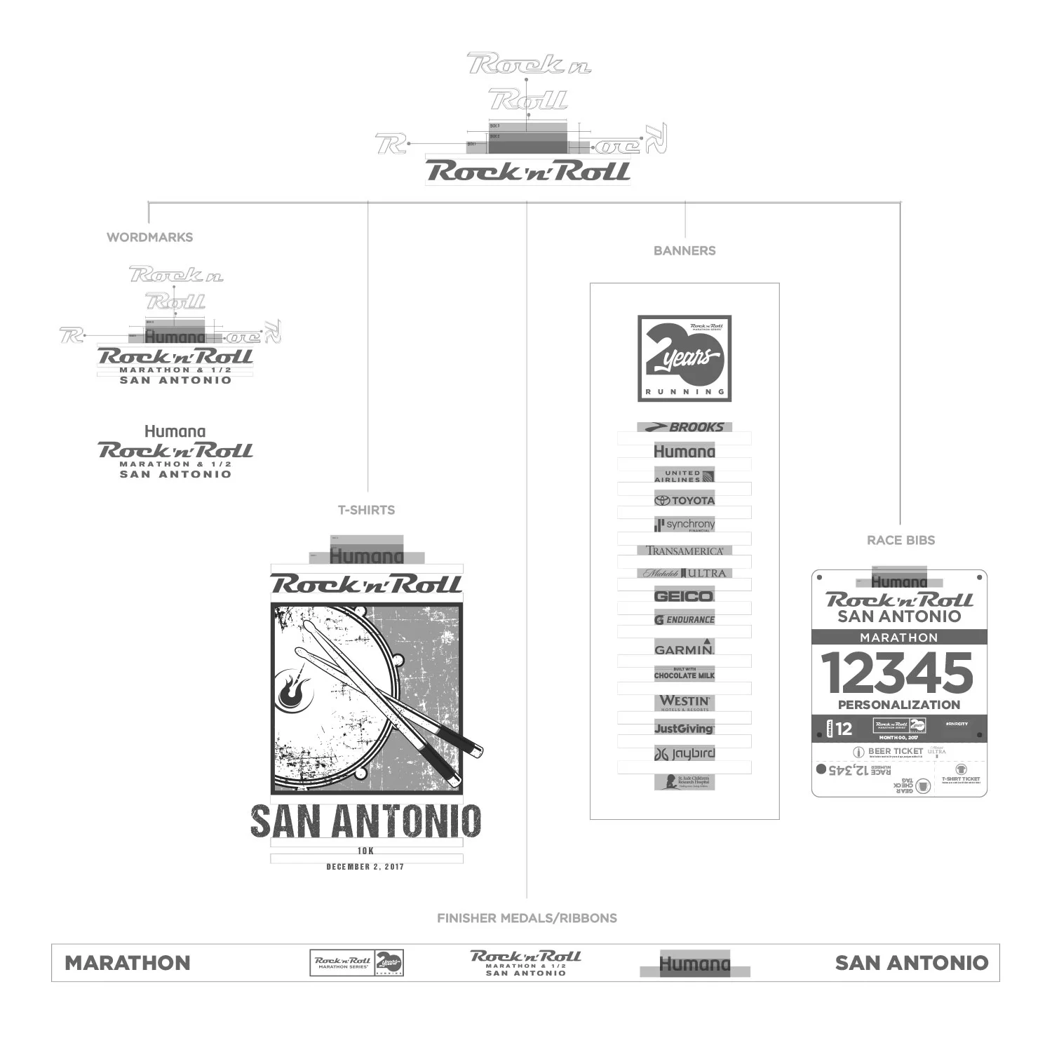
The "box system" bled into many assets and products of the brand. Such as, and not limited to, event wordmarks, t-shirts, race medals and ribbons, signage, and race bibs.
WORDMARKS
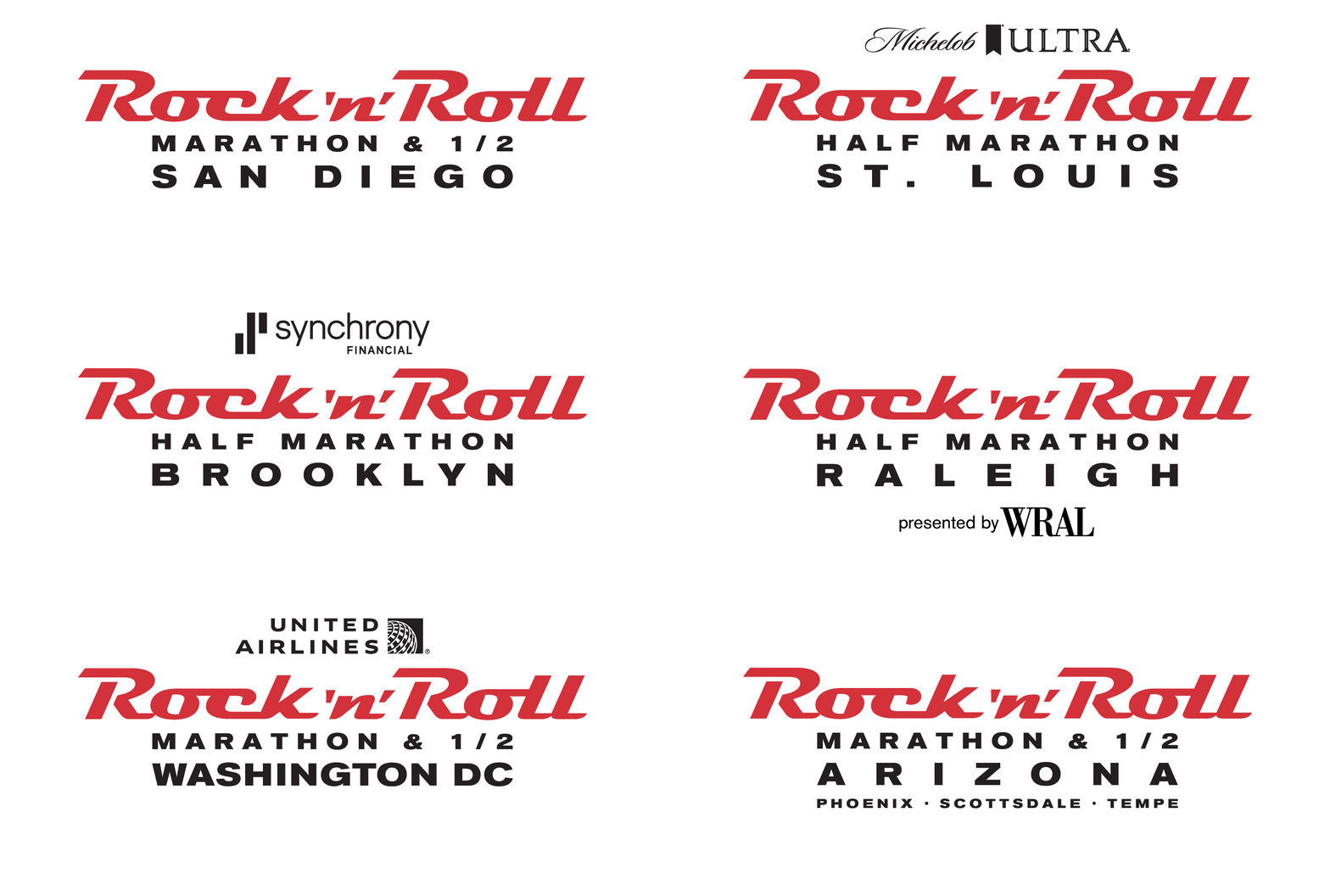
With 31 events globally and numerous distances (with the emphasis on marathons and half-marathons) in each location the wordmarks structure is title sponsor when applicable, Rock 'n' Roll, distance(s) and location. For example, the wordmarks are demonstrated below.
T-SHIRTS
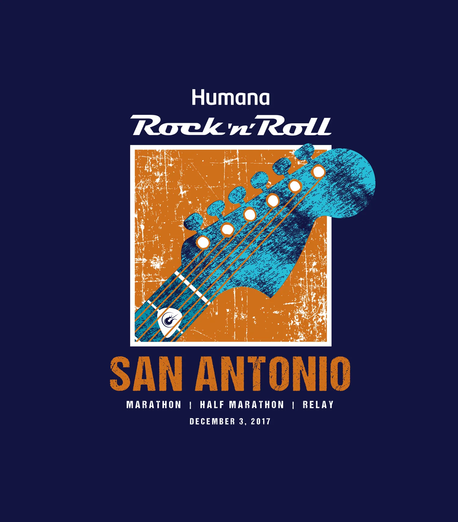
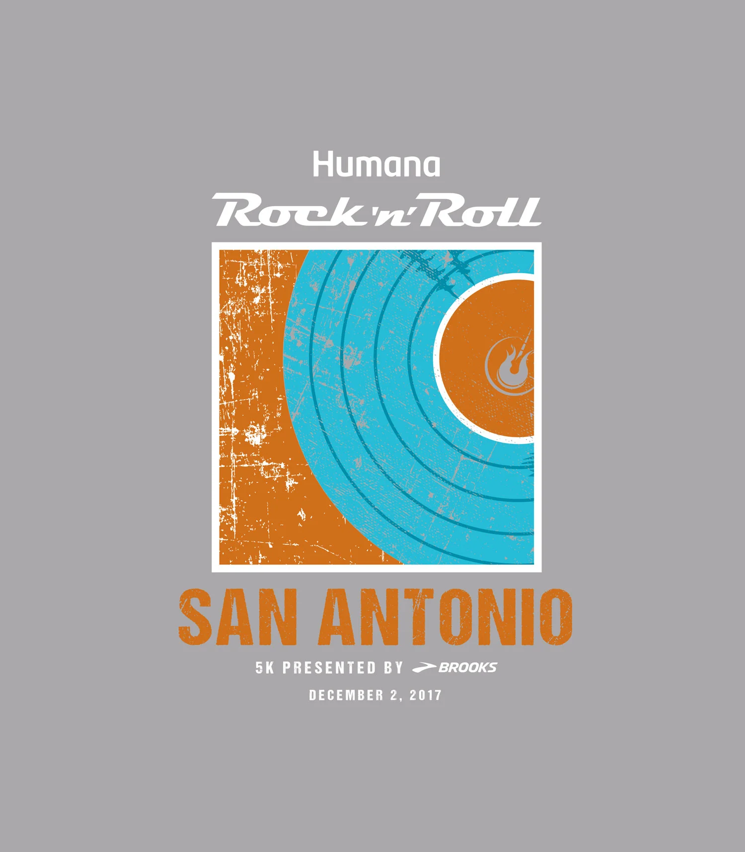
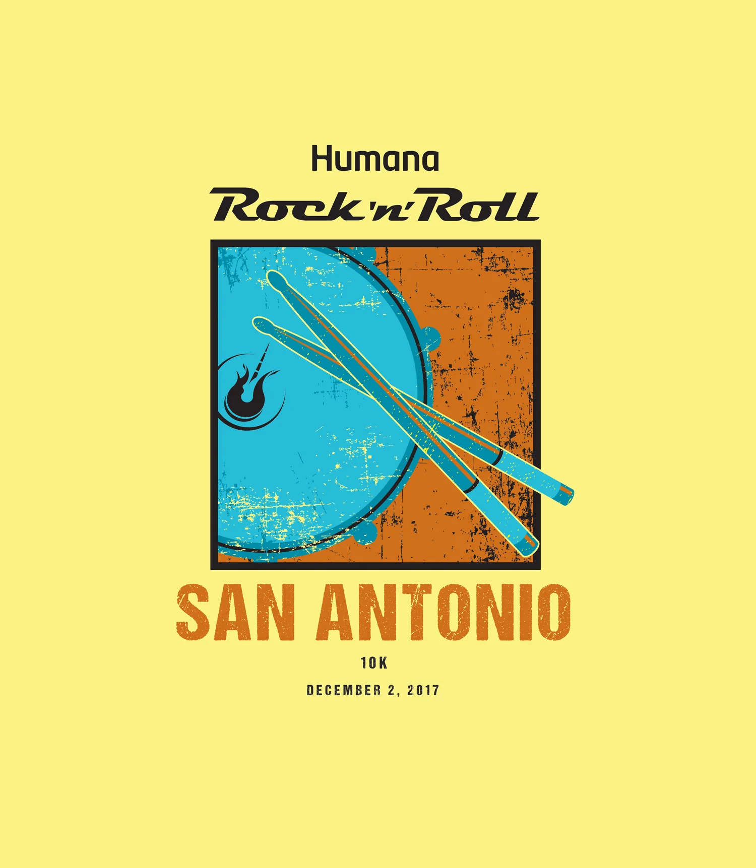
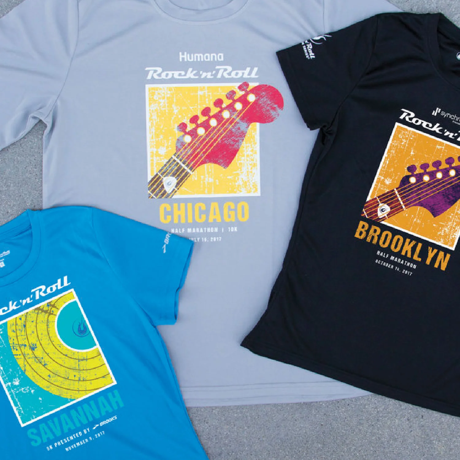
The t-shirt is another example of successful implementation of the "box system" standardization by creating participant awareness and brand association. This marketing program investment, Competitor Group realized improved efficiencies and reduction in design rework, while providing on time delivery of the t-shirts.
FINISHER MEDALS & RIBBONS
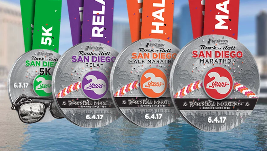
The race medals are conceptualized by the Event Manager. They work with a third party company to see their concept come to life. A system needed to be created to help clean up inconsistencies with fonts, logos and order of the elements. The solution was a standardized template used across all Rock 'n' Roll markets.
BANNERS
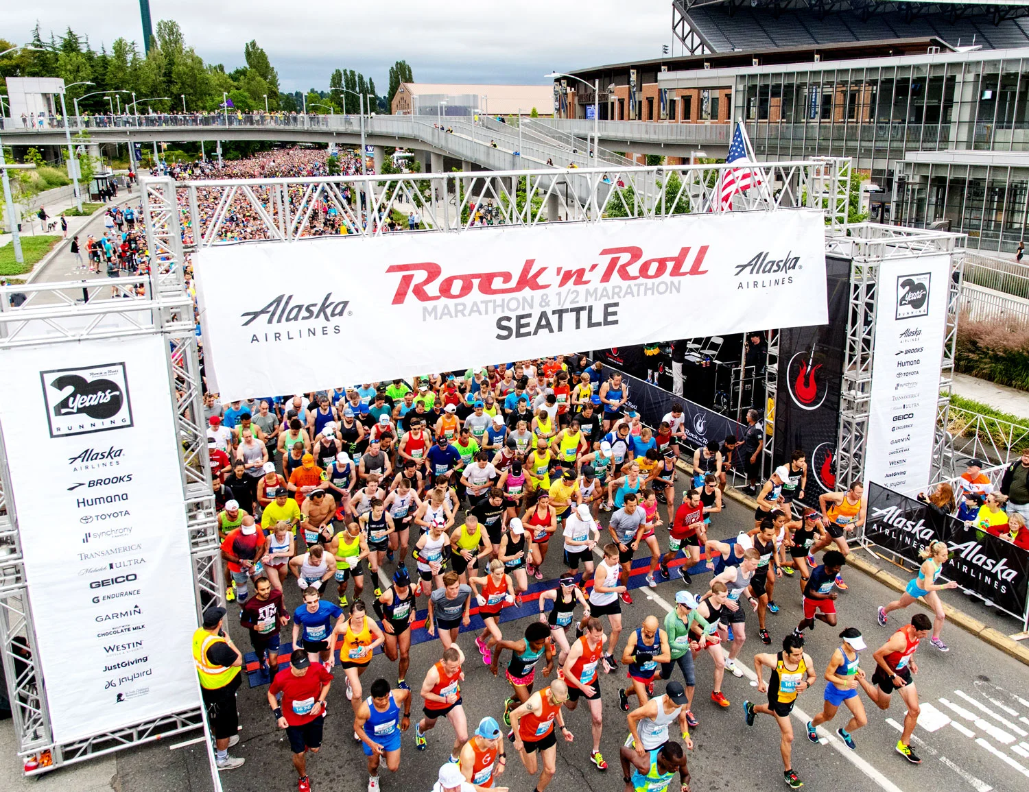
One of many partner's benefits is the inclusion on the start and finish banners for race day. The sizes of the logos did not adhere to any sizing requirements. Making it difficult to consistently accommodate partner's expectations. Once the "box system" was created it was incorporated into the tower legs resulting in internal and external customer satisfaction.
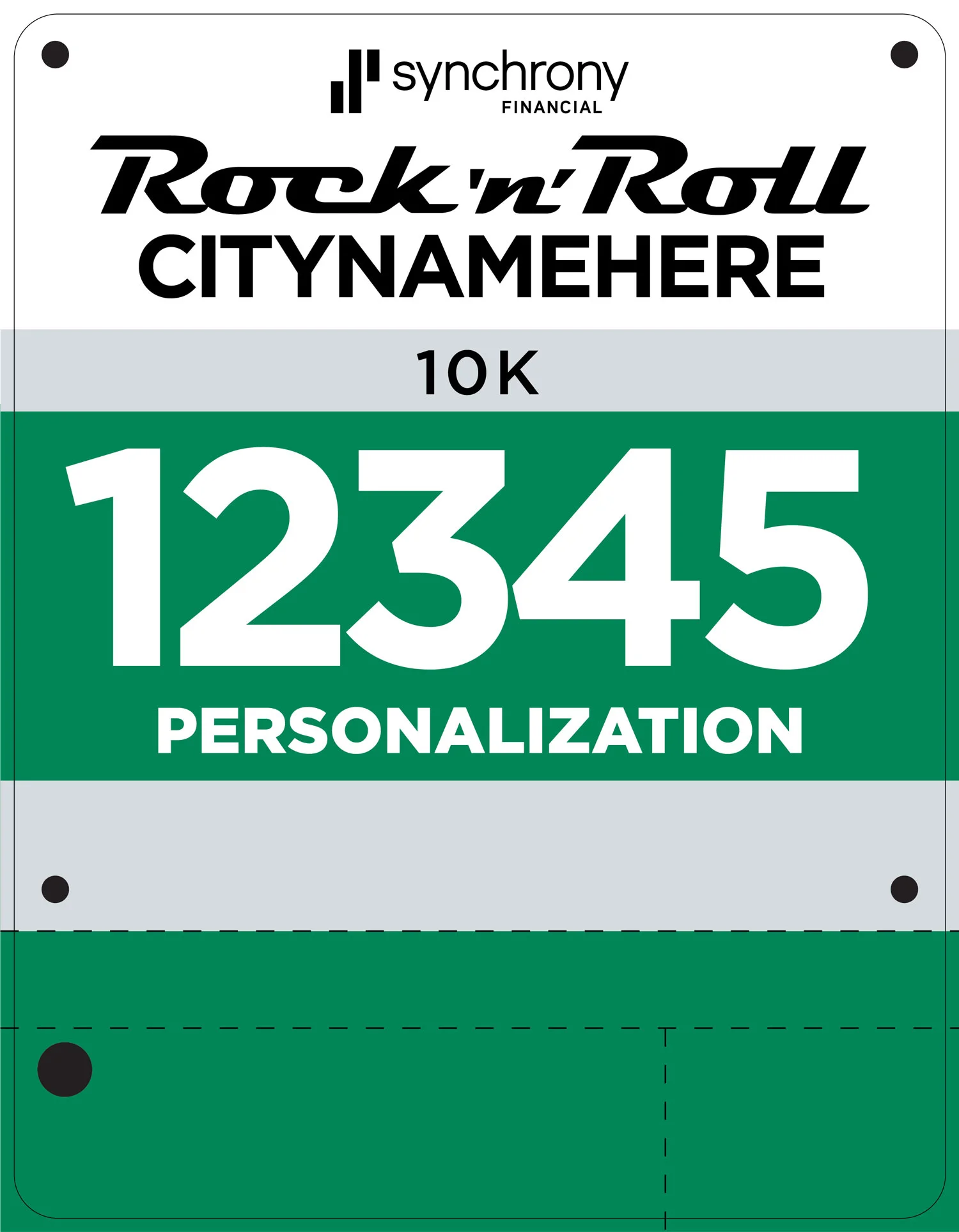
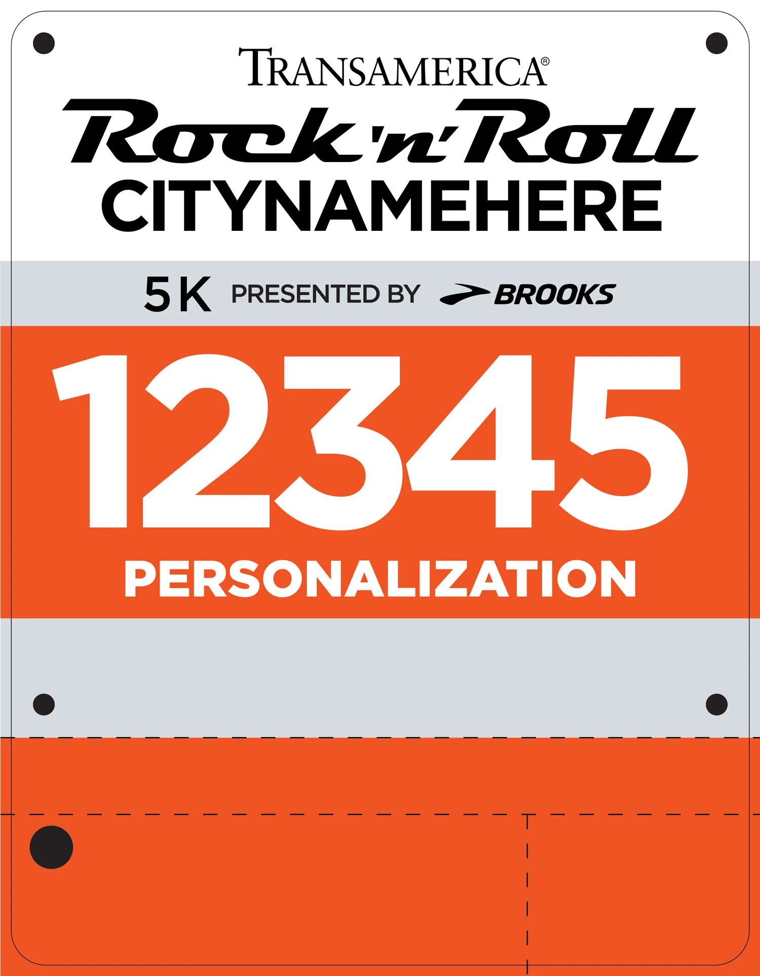
RACE BIBS
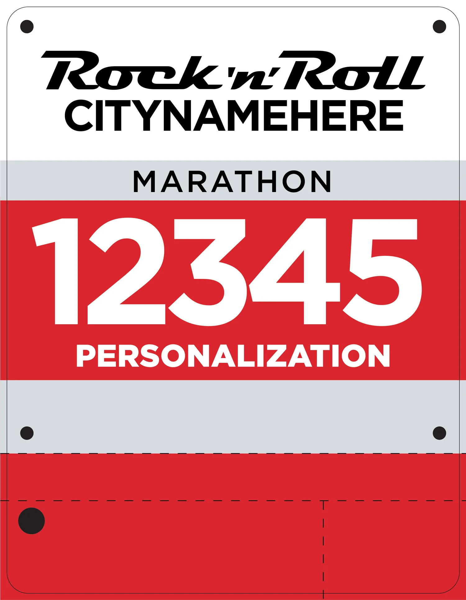
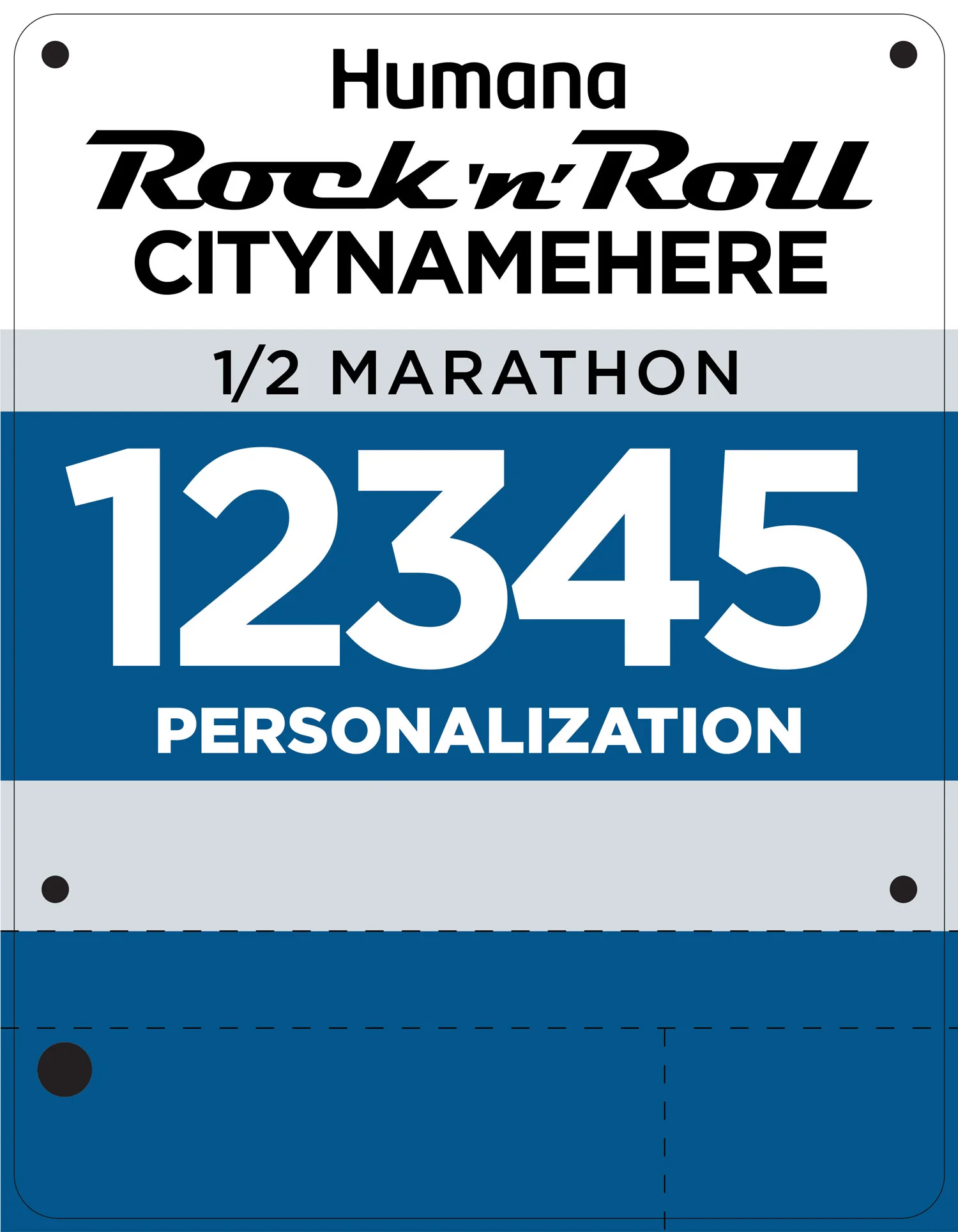
This is another example of creating standardization across all race products using the "box system".
